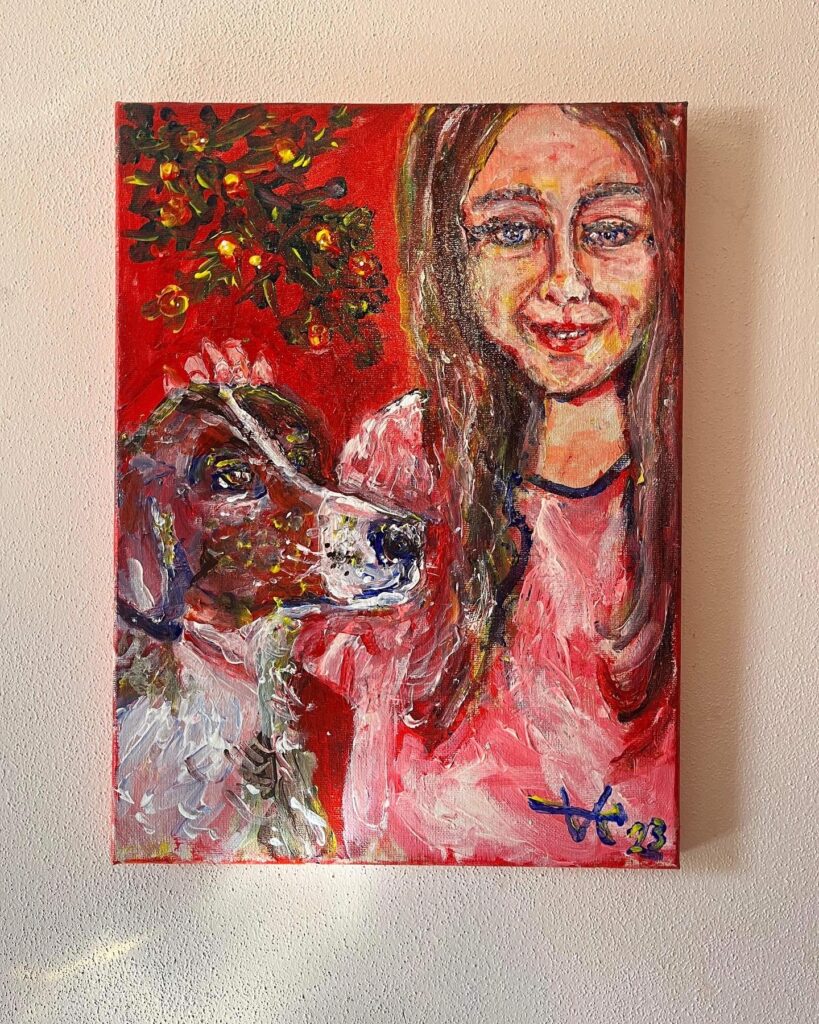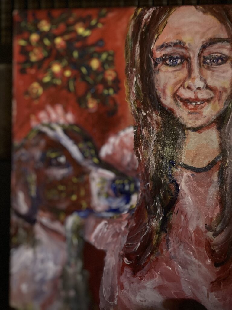
The above is a high contrast photograph of a portrait that I recently painted of my daughter. Red is the dominant color. Shadows are red. Low areas are red. High contrast is achieved through a vibrant, undiluted bright red.

Below is a video that shows the process by which the painting came about.
Using vibrant unmuted colors can be a stylistic choice. This same portrait could have had more muted and natural looking colors by adding a semi-transparent coat of greyish white over the top.
Let me know in the comments if you think the reddish light in this portrait is too harsh.
